
Brekkehuset is a colour consultant that stands out by daring to use bold colours, and playfully fresh colour palettes! A clear contrast to the safe and secure beige and muted colours often trending.
My task was to reflect this colour- and playfulness in a visual identity, including the logo, colourpalette, icons and a pattern :)
Services: Logo & Visual identity
My task was to reflect this colour- and playfulness in a visual identity, including the logo, colourpalette, icons and a pattern :)
Services: Logo & Visual identity
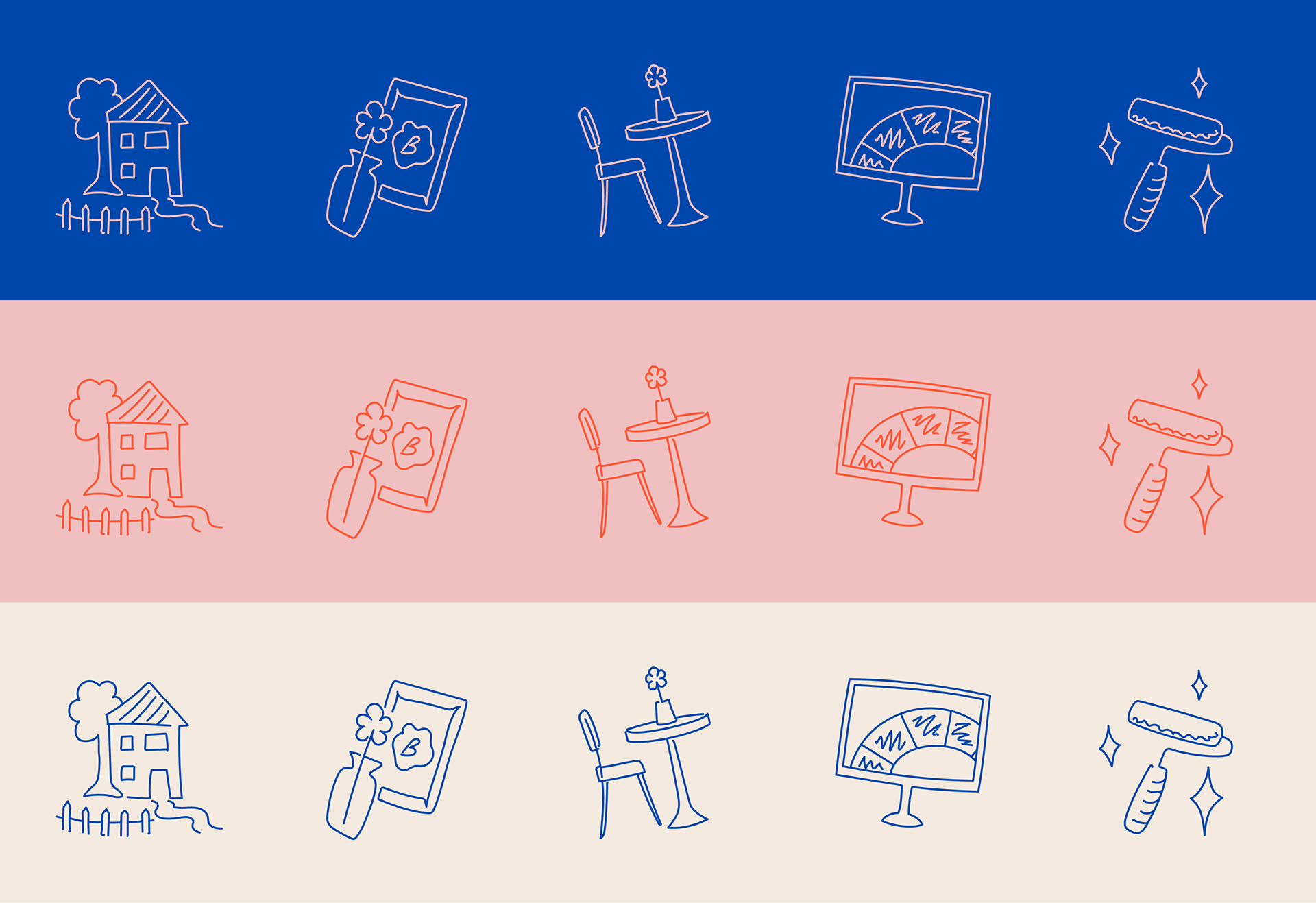
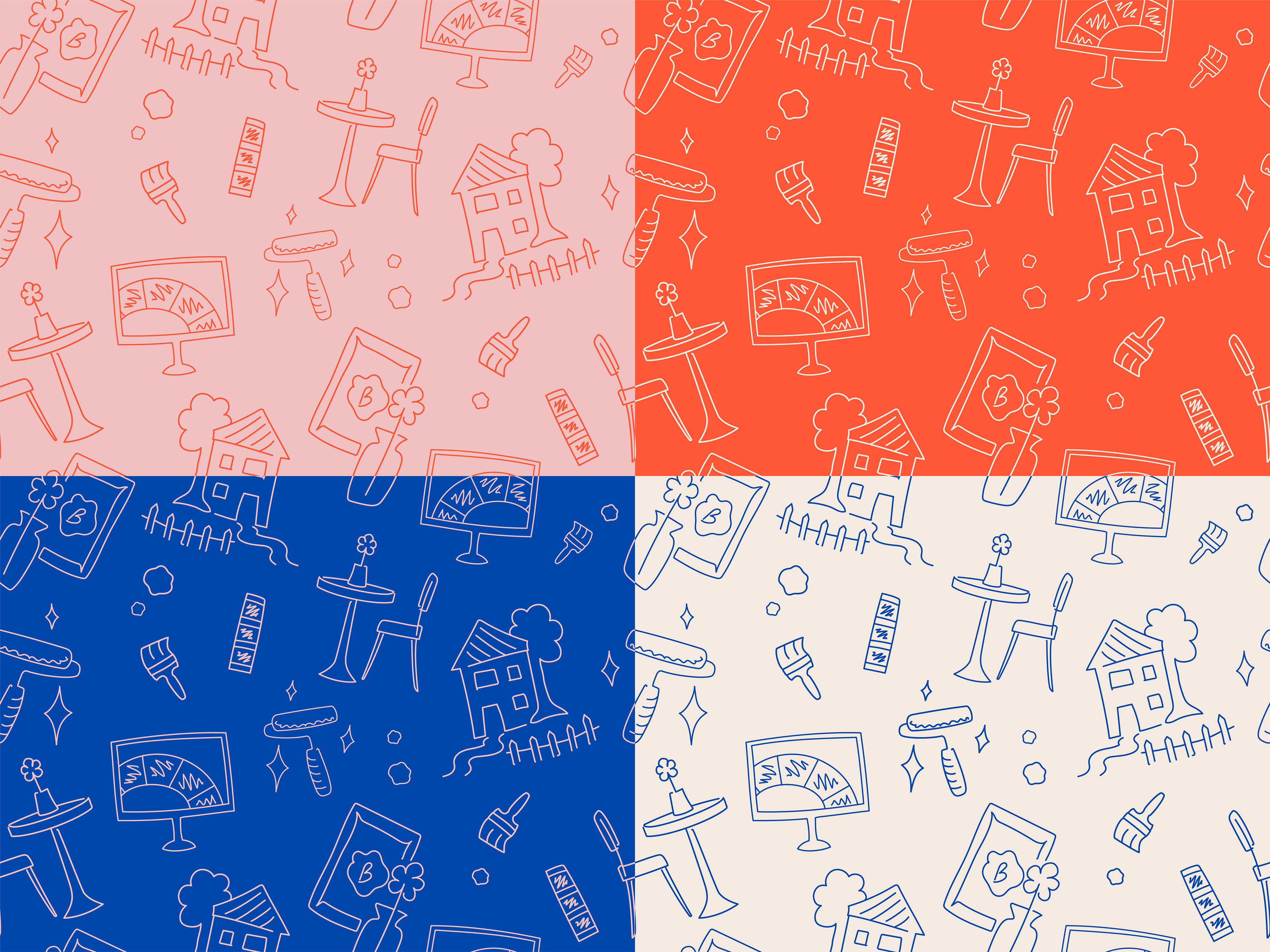
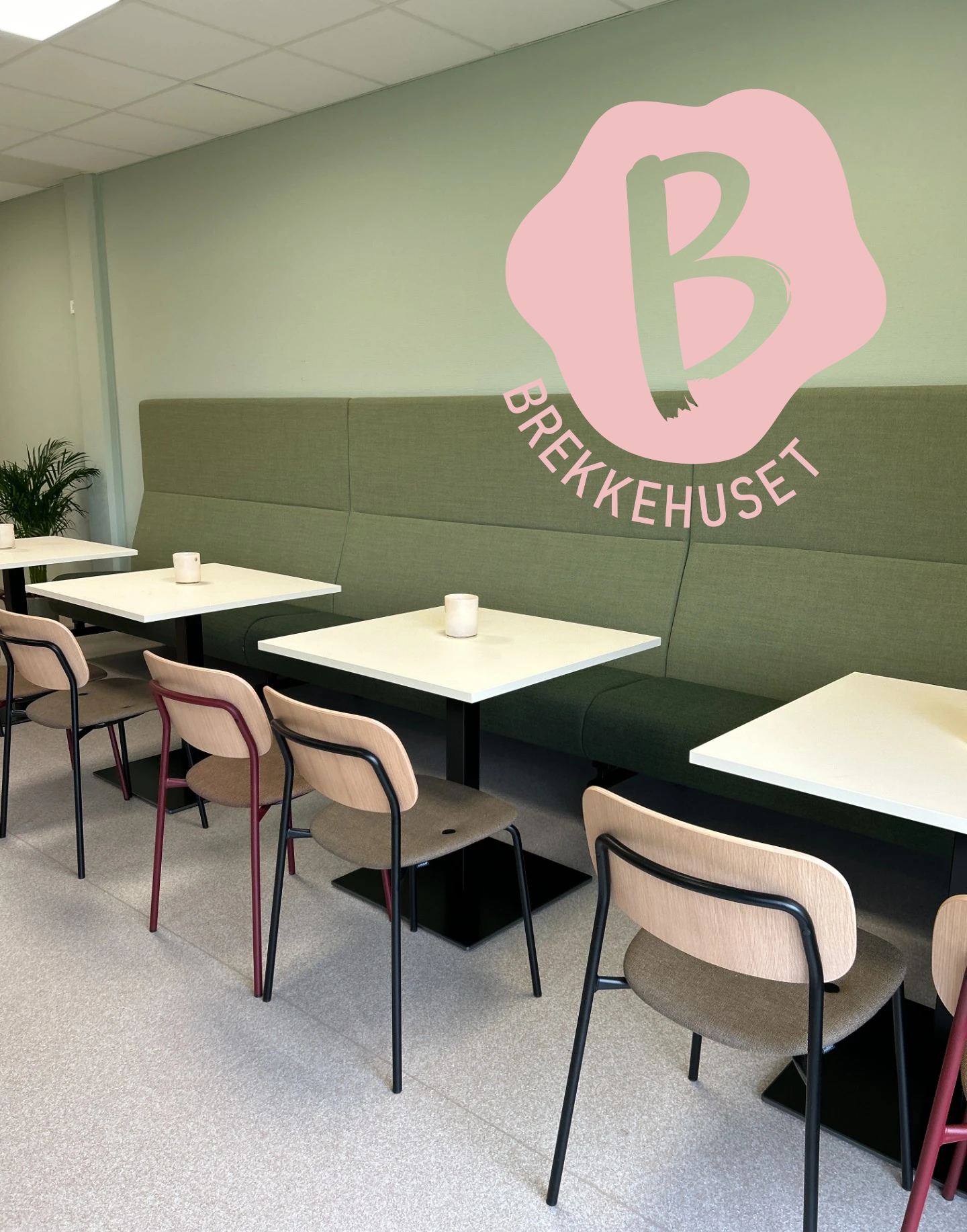
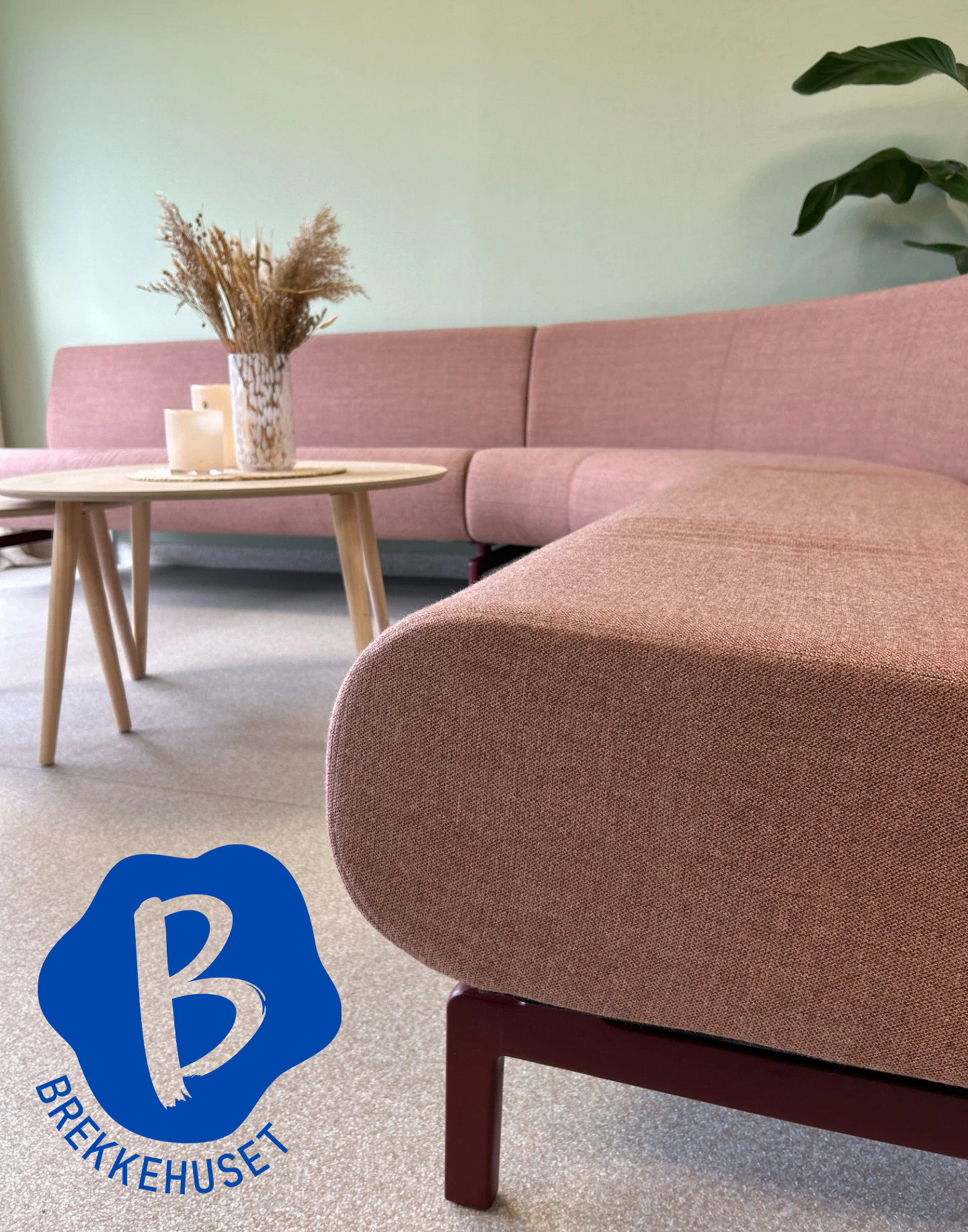

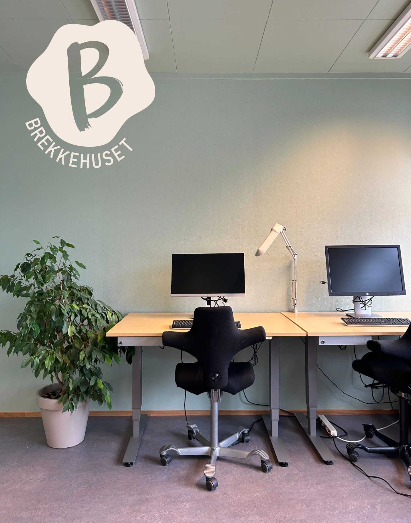
Photo: Solveig Karin Brekke (Brekkehuset)